
Flight Planning Website
This project was done in two phases. Phase 1 was an update to the workflow of the current flight planning piece of the website. Phase 2 was an upgrade to the website and integrating a flight planning engine the engineering was building.
Phase 1
To understand the issues with the current site I met with our flight services team who assisted customers with flight planning. For some customers, they did all of their flight planning. The output of that workshop was a number of suggestions for phase 1 updates to the website and flow and things that fed into phase 2.
Customers had complained about how difficult the website was to use. We wanted to address the issue. The colors and styling were selected to match the design of the existing site so it would blend in.
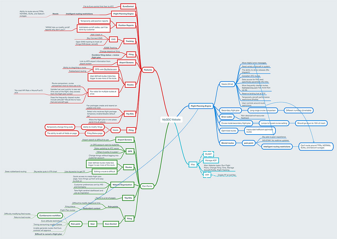
The main frustrations we addressed with the phase 1 update were with the website were how improving the workflow, and combining things that made sense to be on one page. The users also wanted to see the map more to understand what the routes looked like and where the waypoints were. The workflow was also very segmented and things that should be together were not. The mind map below captures all of the pain points from the workshop.
I also worked with the product owner who was a pilot and had done flight planning in her previous job. She knew the logical order of data entry and how flight plans should be constructed. I learned so much from her and the other designers on the aerospace team.
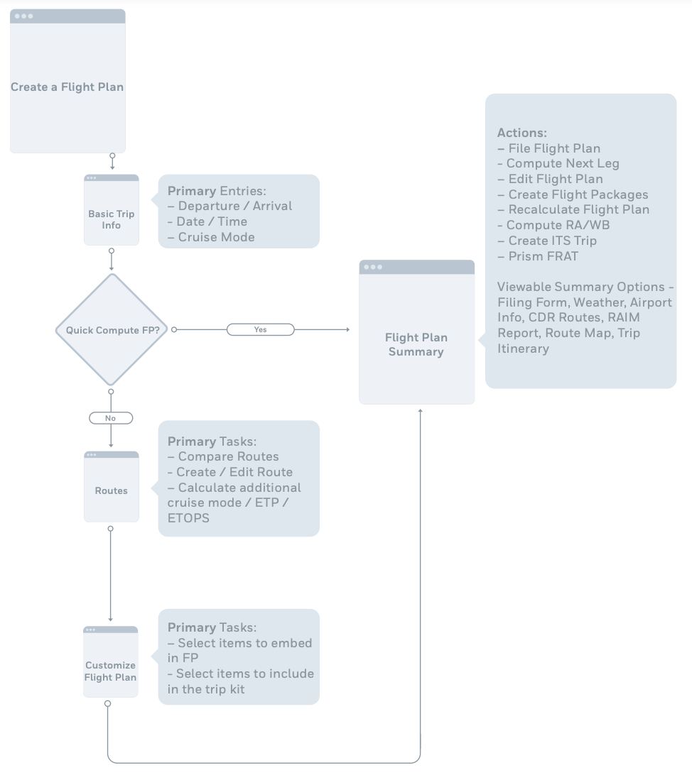
After meeting with these two groups I mapped out the workflow for the new flight planning website prior to starting to build screens in sketch.
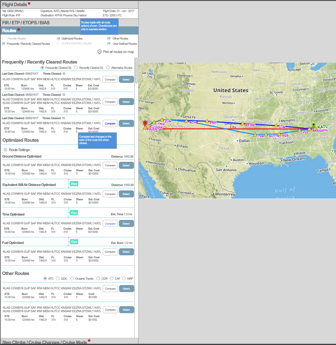
The designs for phase one were created to emulate the colors of the current website as much as possible. The same color scheme was used but the styling was slightly updated. Video walkthrough of the Axure prototype for phase 1.
Phase 2
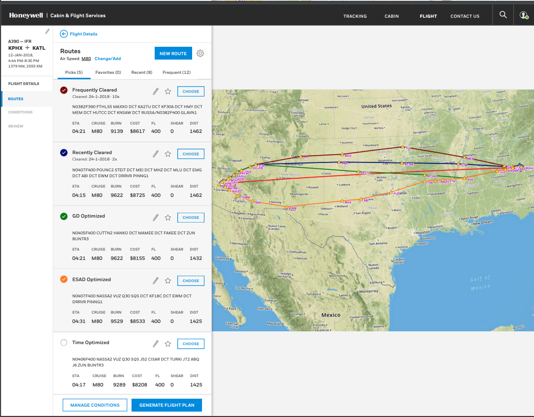
In phase two the major experience upgrade was on the route comparison page. The new flight planning engine made it possible to calculate better routes giving the user fewer but higher quality routes organized into tabs by type. It also allowed for a cleaner route editing experience and for the user to save favorite routes.
After this set of designs was created I started to move into a product management role for a different product. Another UX designer was brought on to work on the flight planning screens to give it more visual sophistication.
Below is a video of the current flight planning experience. You can still see the work I started to reorganize the workflow and evolution of the designs I started in the final product.